Twenty Five to Four
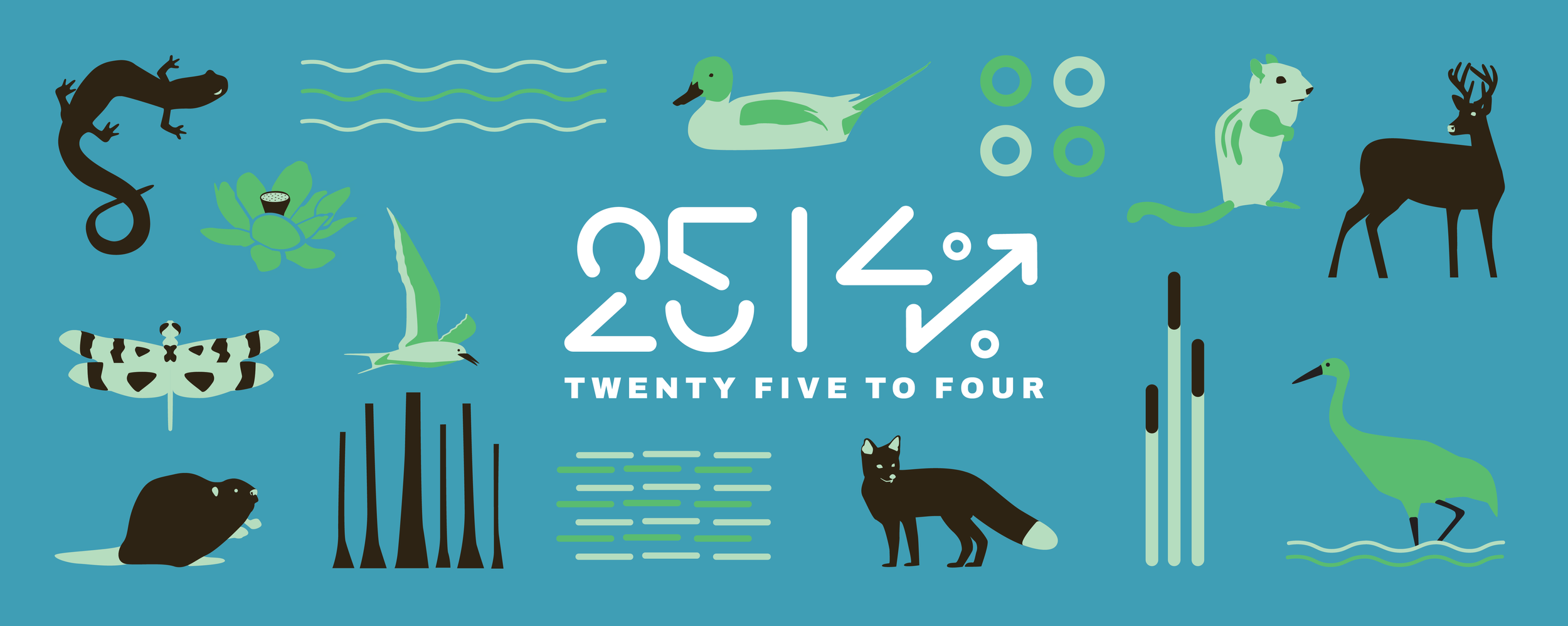
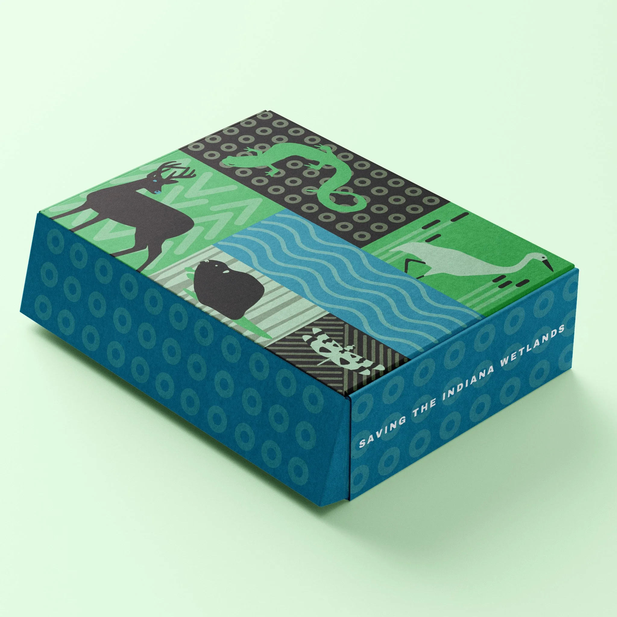
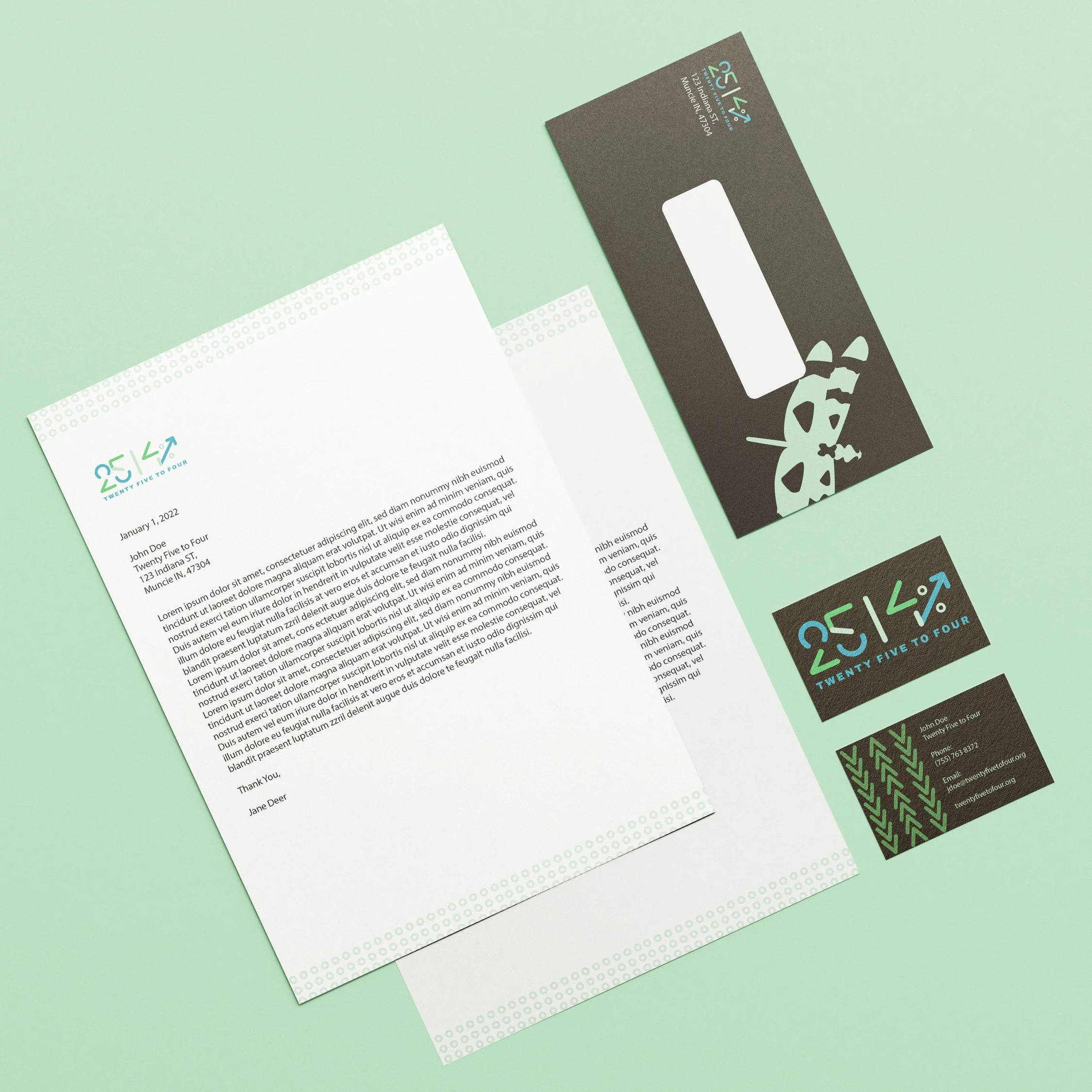
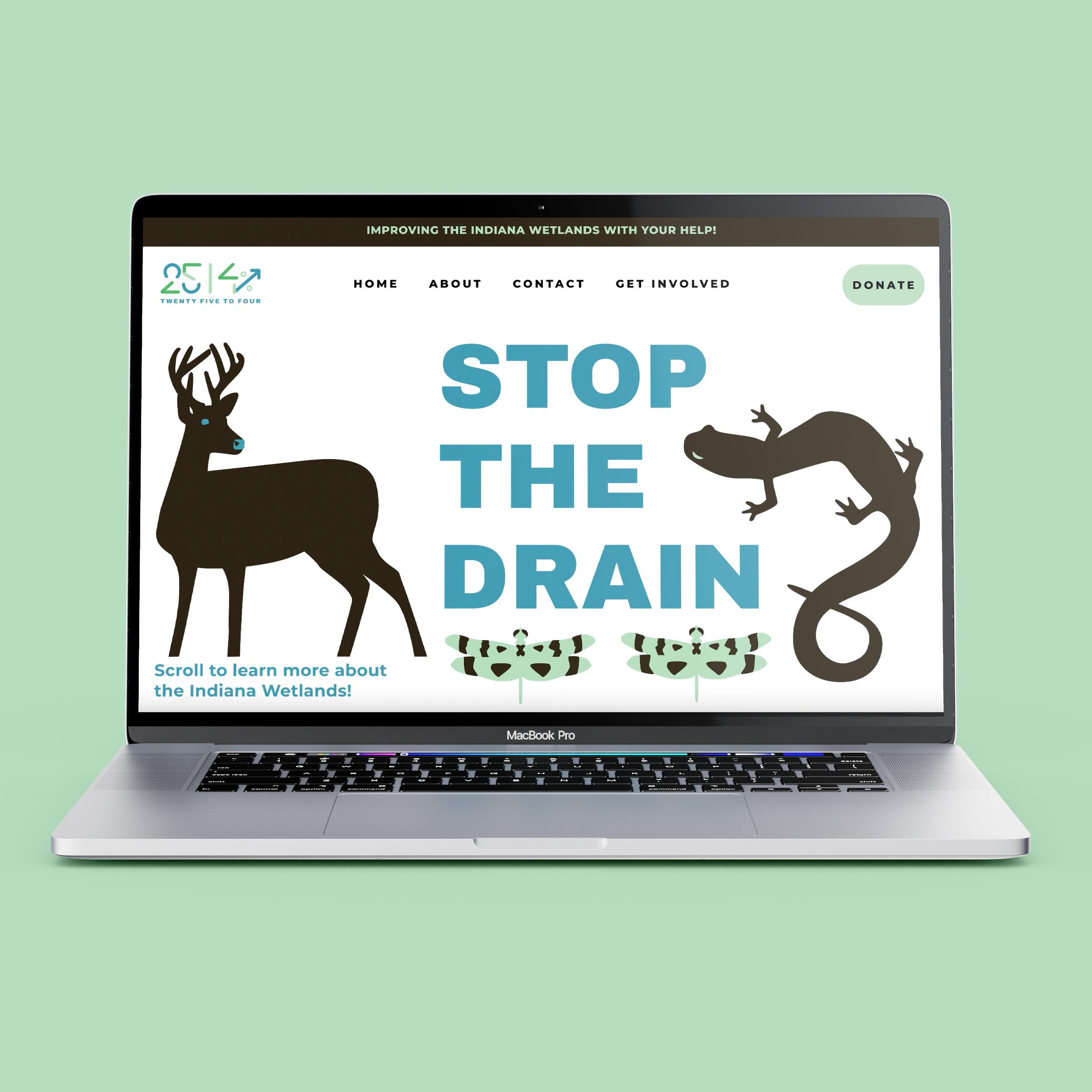
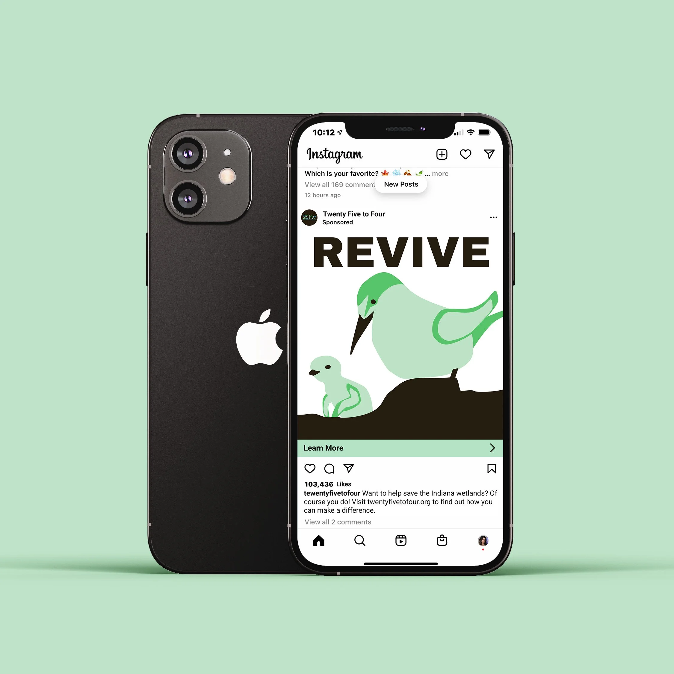
Twenty Five to Four is a theoretical company that raises money to help maintain and restore the Indiana Wetlands. In this campaign a logo, brand guide, poster series, membership box, identity system, a social media ad, and a website were created
Website Walkthrough
A video showing the website walkthrough for the theoretical company, Twenty Five to Four. The website was created and prototyped in Figma.
The Logo
The numerals for the logo were abstracted and created out of deviled lines. The ends were rounded to give it a friendly appearance. To contrast the soft edges of the numbers, a thicker typeface was chosen. The logo is modern and sleek to give a fresher feel to land conservation.
Brand Color Scheme
The colors were chosen based off of pictures of the Indiana wetlands. Blues and greens were the most prominent colors in the images and were therefore chosen. The blue and green give the logo a light and fresh look and a positive tone to the company.

