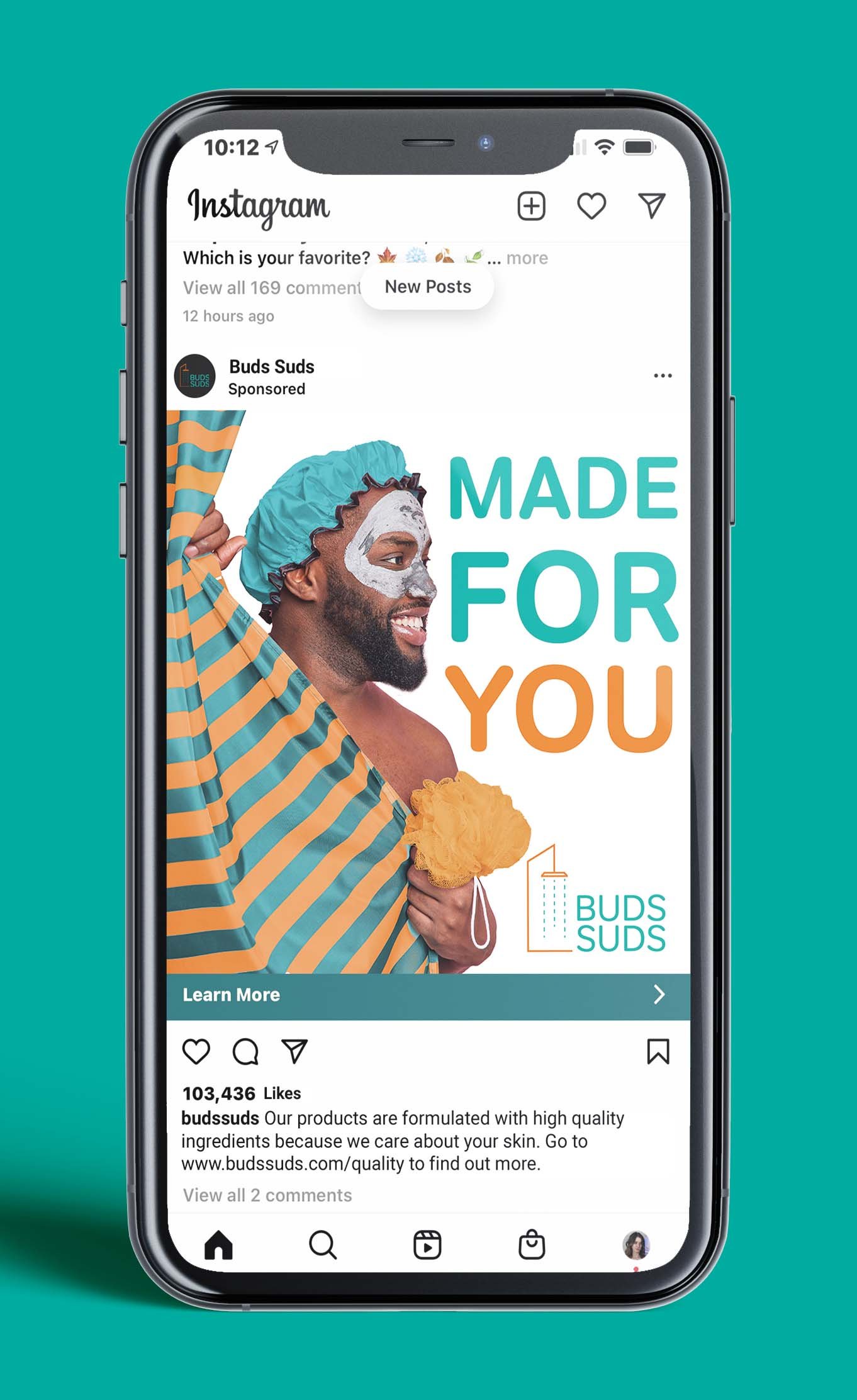
Buds Suds Brand Campaign
Buds Suds is a theoretical mens bath and body care company. The goal for this project was to create a consistent visual language across a brand. A logo, a style guide, and an ad campaign are the three main components of this project.
The Ads
Images of men doing self care were edited to match the brand colors and aesthetic. Buds Suds is not an average mens body care company. Therefore a visual language was created that was fun, colorful, and worked to reject the ideas of toxic masculinity.
The Logo
A combination mark was designed for the logo. An abstracted shower was designed for the pectoral mark. A single line was used for the shower to give it a sleek modern look. A soft typeface was used to contrast the sharp angles of the shower. Also, it was intended to give the illusion of soap bubbles.
Buds Suds Brand Guide
A brand guide was created for the company in order to help maintain brand consistency. Rules about logo usage, white space, color choice, image making, and tone of voice were all covered in this guide.


